


وحي القلم
مدير عام مساعد (مصمم بنرات المنتدى)
طـــاقم الإدارة
★★ نجم المنتدى ★★
فريق الدعم لقسم الحماية
نجم الشهر
فريق التصميم
كبار الشخصيات
فريق دعم البرامج العامة
- إنضم
- 1 يناير 2014
- المشاركات
- 20,748
- مستوى التفاعل
- 39,057
- النقاط
- 32,966


غير متصل

الحمد لله الذي علم بالقلم، علم الإنسان ما لم يعلم، أحمده حمد الشاكرين، وأثني عليه بما هو أهله، والصلاة والسلام على معلم الناس الخير، وعلى آله وصحبه، وكل من دعا بدعوته واقتفى أثره إلى يوم الدين.
وبعد
إخوتى الأعزاء أهل زيزووم الكرام أقدم لكم اليوم مجموعة خطوط
Mr Palker Font Family
وهى مجموعة خطوط مكونة من 6 خطوط
قيمة المجموعة
$180.00

Mr Palker Font Family
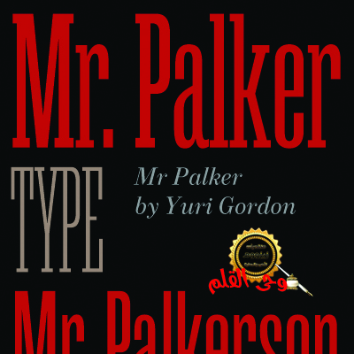


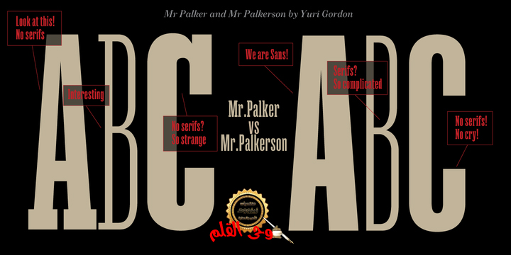
A slab serif Mr Palker and grotesque Mr Palkerson build one superfamily together.
These are blank types. In a way even the display ones. Typefaces for newspapers, announcements, cheap advertising and police posters.
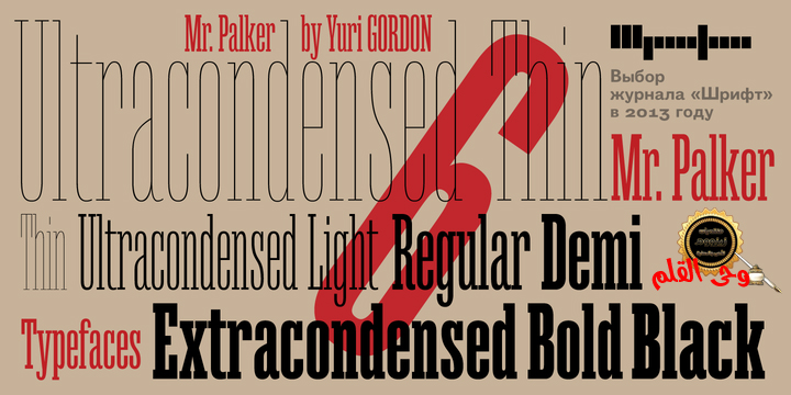
Mr Palker and Mr Palkerson will turn every language into a fence. And due to six types of faces one can choose what material should the fence be made from — from Thin steel rods to the Black stone blocks. In their simplest appearance Mrs P&P are intended for the solid blank composition in victorian or industrial style. They are quite decent, a bit old-fashioned slab serif and grotesque with closed aperture.
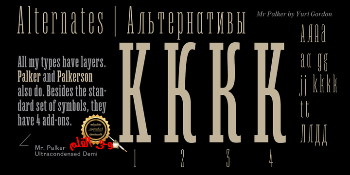
All my types have layers.
Walker and Palkerson also do. Besides the standard set of symbols, they have 4 add-ons.
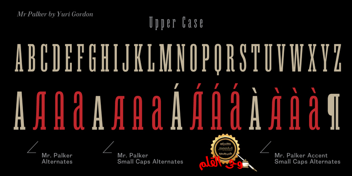
1. Alternate glyphs, including unicase ones.
2. Ligatures with A letter.
3. Extra tall small caps.
4. Two-storey ligatures.
All this options are intended for the complex composition. The additional letters are rather eccentric as their main function here is to imitate the victorian oddities. Imitate, parody, just not repeat.
There are lower-case As and Es in the set in height of small caps and uppercases. They can turn every writing into the unicase.
The lower-case A (as well as uppercase and small caps version of it) has deliberately by my taste grown a ludicrous tail. To compensate it I’ve built all the possible ligatures - ад, ал, ая. There are 35 of this ligatures all together.
Take a closer look at the Russian letters D, L, K, Ya from the main set as well as their alternates. The additional glyphs are one more comic than the other — on purpose to imitate (not to repeat!) the victorian set.
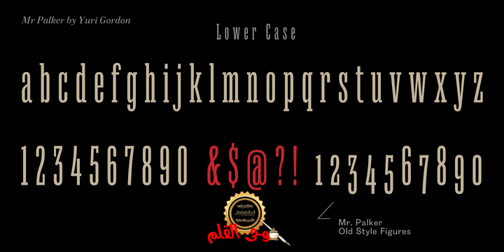
This sets have lowercase numbers. And small caps numbers as well. What a modern typeface without them.
They also have an У-letter with a generously curvy tail. As if before the WWI.
The Latin of course has alternates as well. It has letters to make the perfect French sound more like the russian provincial version of it. The tails of Js and Ts can be made a little bit more open — or a little bit closed.
My favorite feature here, an invention of a kind - extra tall small caps. It allows to compose logos with the small caped uppercases directly from the keyboard. The small caps of this typefaces are usually much taller than the customary ones.
This is the kind of small caps that Palker and Palkerson have. More to that, the strokes’ weight and the letters width are corresponded to the uppercases. Just a ready set for making a logo a la 1913 style. With a unicase, one has to mind!
One more trick with the tall small caps is a possibility to make them work like lower uppercases. Their height is just in between of lower- and uppercases. Isn’t it great to have an additional set of uppercase working ponies in stock for the case of emergency.
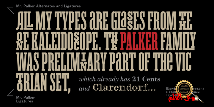
And finally — the trademark of Palkers family, two-storey ligatures.
They are made in the height of uppercases and turn every writing into an ornament or a puzzle of a kind, while at the same time making them much shorter. Each face has 90 of them. Mainly those are twins: CC, BB, DD and so on.
ll this things are for the unhasty compositing, even for lettering. Which means that for the things which are not there you always should have Command+Option+O and some patience. Also — among the two storey ligatures one also can find some belvedere villas.
All my types are glasses from the one kaleidoscope. The P&Ps family was preliminary part of the victorian set, which already has 1 Cents and Clarendorf - optionally one can add Costro, Gordoni, Handy, Guardy, Surplus, Red Ring, Red Square, Babaev to the list. And also Sklad, Odessa, Dreamland, Romb, Platinum - here, at Letterhead’s, every second one is victorian. All together our typefaces can allow one to set advertisement of any kind, even the trickiest one, and compose everything, from the coffee place’s menu to the antiquarian magazine
السيد Palker والسيد Palkerson هما من قاما بتصميم خطوط Mr Palker
صممت هذه الحروف للصحف والإعلانات والدعاية والملصقات .
وهذه العائلة من الخطوط لها ستة أنواع من الوجوه يمكن للمرء أن يختار منها فهى من الرقيقة إلى الكثيفة . ويقصد السيدة P & P تكوين الحروف من الطراز الفيكتوري وقليلا من الطراز القديم .
وهذه الخطوط تحتوى على :
1. الرموز البديلة
2. الحروف المركبة مع خطاب.
3. قبعات صغيرة القامة إضافية.
4. الحروف المركبة من طابقين.
وتهدف جميع هذه الخيارات لتكوين الحروف الإضافية فى شكل غريب الأطوار نوعا ما.


$180.00

https://www.myfonts.com/fonts/letterheadrussia/mr-palker

فى المرفقات
أبو عبد الله
وحى القلم

المرفقات
التعديل الأخير: